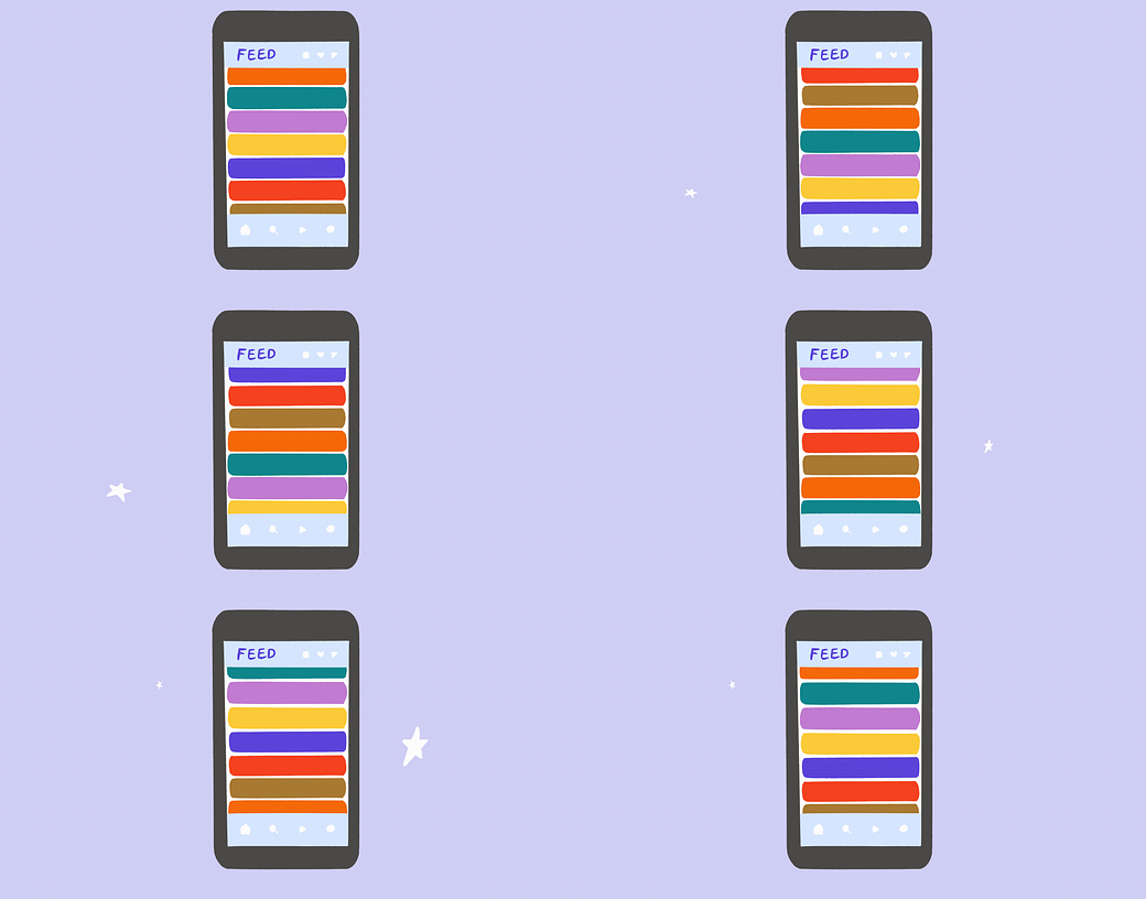
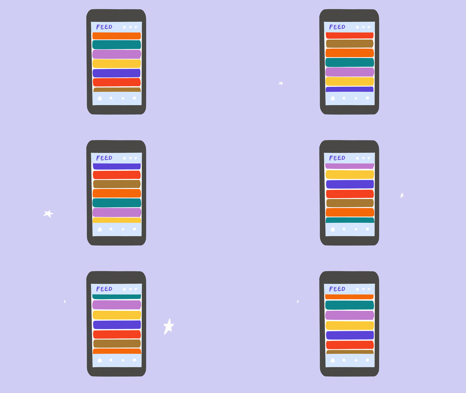
🤔 What comes after the social feed?
Exploring alternative ways to navigate besides the infinite scroll
📱 Sara Hendren and her students on feed alternatives
🚦 Physical to Digital: The stroad
Facebook introduced the News Feed in 2006, when I was a sophomore in college. I remember the adrenaline hit of scrolling through my friends’ posts, all in one place. The completist in me always wanted to reach “the end.”
That’s not possible now: thanks to algorithmic recommendation engines or networks that easily grow far beyond a person’s Dunbar number, you can scroll for days without running out of fresh content, making “the end” nothing more than an illusion.
The feed is such a familiar, dominant organizing structure for social platforms I feel silly describing it to you. But is it inevitable? Are there other ways we could build platforms that might welcome users, engender connection and understanding, and facilitate action? What other styles of platform navigation might allow us to feel safe and flourish on digital public spaces?
At New_ Public, we suspect there are many different options that are worth thoughtful consideration. In fact, we’ve encountered a few before. In June we wrote about the digital gardens of the upcoming platform Somewhere Good, and in October I interviewed Brian Swichkow and his wife Chantle Edillor about their wedding on Topia.
We think of alternatives like these not necessarily as replacements for the feed, but part of constellation of platform designs that might serve different purposes in our lives. You may not think about chat as a social platform, but it’s undoubtedly part of the ecosystem. Today, we over-rely on the feed as a one-size-fits all solution. A Swiss Army Knife, primarily a knife, often also has a tiny pair of scissors on it, which is great if you’re in the middle of the woods and that’s all you have. But if you have to do a lot of large, precise cuts, there’s no question that some expertly-made1 artisanal scissors would be better. My point is that we can have different types of social media platforms for different things.
To go deeper, we turn to our Contributing Editor Sara Hendren, who is a writer, artist, design researcher, and professor at Olin College of Engineering, and whose meditations on the private network Notabli we featured last week. Here’s Sara:
Feed me, Seymour!
In a recent open thread, someone asked me about alternatives to the list-style feed that is the default engagement in social media—whether there are experiments in visualization that arrange our information and interactions differently. I've been thinking about it: Where are the commonplace or brand-new platforms that resist the low-effort incentive to the infinite scroll of a visual list? And might there be clues in lots of places for the future of digital social communities?
I asked two of my former students at Olin College this question to help me think it through: Adit Dhanushkodi and Evan Dorsky. Adit and Evan are the best kind of thinker that Olin produces: lively, curious, critical, with a restless and generative disposition toward the future of tech. They're a generation behind me and a reason for me to be hopeful. We had an exchange by email that I've condensed here:
Evan noted that we could debate whether the ever-novel list as architecture—the feed—is the root of the problem, or whether "more"-ness would find us in other ways if the current financial models remain the same. But if we're seeking alternatives, Evan said we might consider spatial software, and we might remind ourselves about design environments like Miro or Figma and consider their potential for social communities. I knew about those, but new to me were apps like Muze and Nototo, where there might be some clues to spatial social futures.

Evan also introduced us to Kialo (via another Olin alum, Celine Ta), saying, “Kialo is a social medium designed specifically to support online debates about big yes/no questions. (The featured statements are ‘All Humans Should be Vegan,’ ‘The Existence of God,’ ‘Do Aliens Exist?’)” Evan says that Kailo features:
a spatial/pie chart representation of arguments made by each side of the debate, always within reach
a branching tree representation of arguments
a wikipedia-style way to edit and refine arguments
a strong de-emphasis on user identity in the primary display—arguments are not attributed to specific users
Evan says, “Kialo appears to be discouraging repetition of arguments and circular conversations by foregrounding arguments that have already been made. Users are encouraged to explore existing arguments, comment on them, add new ones if their argument is not represented.”
Evan had some caveats, too: he's not sure how heavily Kialo is moderated, or if it could support a Twitter-sized user base. Self-selection may be big there; Kialo is likely only attracting the type of user who wants a civil debate. But the conversations are way more civil and nuanced, he said, than the ones Twitter is hosting.
In the spirit of Mary Madden's piece, Adit reminded us that Google docs has been a popular chat app for teens. There are work-arounds for human-scale engagement in the many places where we're also collaborating around other tasks, rather than flocking to the feed to give us a reason to interact.
Adit also pointed to the grid-style arrangement and open-ended connections in the design of Are.na, saying:
Are.na is a social media/link collection platform that I use to collect and curate reference materials, readings and other stuff I find on the internet. It's social media in that people can connect with links you bring to the platform, but it feels much more like I am curating a garden. While the navigation is very "feed" like, one of the primary ways I use it is via the "channels" or groupings of content I've created.
In addition, the group building this platform is committed to creating a community that doesn't function like most social media. They seem to be very intentional about the features they introduce, keeping things at a smaller scale, and not introducing ads, likes, etc.
So—there are alternatives everywhere, it seems. The feed may not be inevitable, though it's certainly a convenient linear mode for consumption. The question I'll still be thinking about for some time to come: What's a way to make some of our digital interactions feel less like a river (a list) and more like an inlet or bay? Something bounded and contoured in a spatial way?
– Sara Hendren
Here’s another new feature! In Physical to Digital we’ll look at a feature of our built environment and analyze how we might learn from it in terms of digital public space. First up, the stroad.
The Stroad
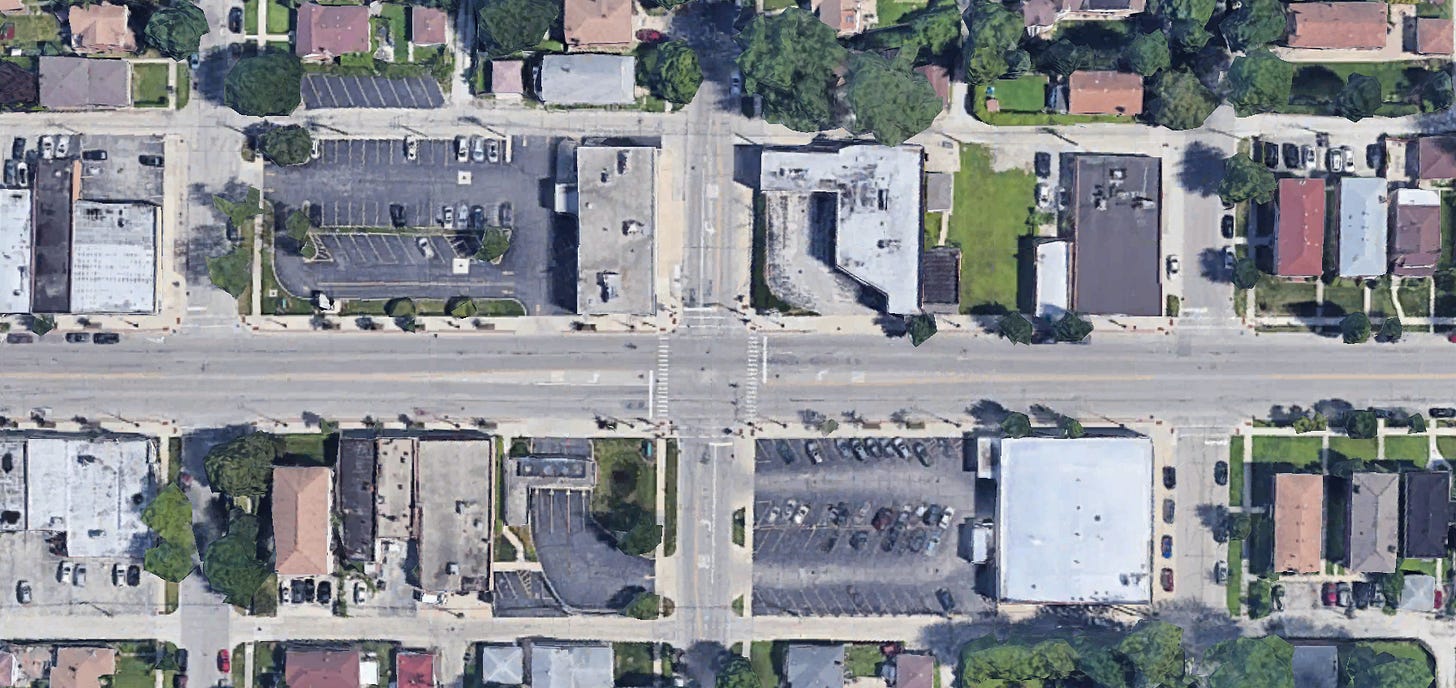
What is it? Stroad is an ugly word for an ugly thing. It’s not a road, which is meant to facilitate efficient and quick transportation between places (think highways), and it’s not a street, which is meant to be a slow, safe destination for all kinds of users (think of neighborhood streets). Coined by conservative-meets-urbanist organization Strong Towns in 2013, a “stroad” is a hybrid between a road and street that does neither purpose well. Stroads are dangerous, stressful (woah, is that car pulling out??!!), and congested, but they are nearly everywhere in North America.
What’s the best version of this? It might not surprise you that the Dutch have a solution. In the 1990s, the Netherlands adopted a Sustainable Safety standard for roadways, and now everything mostly falls into three exclusive types: highways that go around cities, local streets, and distributor roads that connect streets to highways. Importantly, streets are made slow and safe enough for bikes and pedestrians, and distributor roads never connect to houses or businesses—they are completely separate. No highways in the middle of cities and no driveways or crosswalks on open, six lane roads. No holding your breath as you merge or slamming on your breaks in traffic. Instead, what you get is a biking paradise.
What would it be online? Until a few years ago, the main digital tool for communicating at work was email. Email can of course be overwhelming, but you can manage your responses asynchronously—I’ll respond to Bob right away, but I’ll sit on this email from the boss until I have a better answer for her. But new tools, like Slack, have created an expectation of seemingly near-instant responses. At some workplaces, communication has become a jumble of insufficient norms and confusion, almost like a stroad. It’s not a perfect comparison, but a Sustainable Safety-style approach might be to set some common boundaries and expectations about when it’s important to go fast and when it’s fine to take your time. Synchronous platforms like Slack and texting are like roads that facilitate direct, speedy journeys. Whereas asynchronous ones like email are more like local streets, where it’s safe to go slowly, at your own pace. In Portugal, they’re going further with a “right to disconnect” that makes it illegal for employers to text employees after hours. Now that’s a boundary!
Updating my Facebook status,
Josh
Illustrated gif by Josh Kramer. Screenshot is of our Terra Incognita Miro board. Satellite screenshot via Google Earth.
New_ Public is a partnership between the Center for Media Engagement at the University of Texas, Austin, and the National Conference on Citizenship, and was incubated by New America.
What do you call a master of putting together scissors?


This reminds me of Fraidycat, a unique social feed reader (desktop and browser extension) that only shows one item per follow: https://fraidyc.at
(I was referred here via [This Too Shall Grow](https://ckarchive.com/b/xmuph6hrrvooq))
Dear Sara, can me, you, Adit and Evan have a conversation HERE in this thread about a novel alternative to the feed. I am sure that the conversation will be expansive and generative conversation. What do you think? I can put more information here if that helps.