Our magazine launch is right around the corner! We’re publishing the first issue of our digital publication, with original pieces of reportage, illustration, Q+A and even speculative fiction. These thinkers and writers are all revolving around the theme of decentralization, but they each come at it from a range of surprising perspectives and orientations. This week we’re previewing the issue with Wilfred Chan’s Letter From the Editor. Also, a behind the scenes look at the design-process with Josh Kramer and What’s Clicking.
💾 How Ursula K. Le Guin redefined “technology” for us
🎯 What we talk about when we talk about decentralization
📰 How we made our new/old digital logo and newsprint nameplate
Letter from the editor
In a short commentary posted to her website in 2004, science fiction author Ursula K. Le Guin wrote that the concept of technology is “consistently misused to mean only the enormously complex and specialized technologies of the past few decades, supported by massive exploitation both of natural and human resources.” Rather, she argued, technology should be understood more expansively, as the way “society copes with physical reality… the active human interface with the material world.” Technology, as the sum of “what we can learn to do.”
This magazine is about technology. It builds on Le Guin’s formulation by asking how society copes with digital reality, what happens at the interface between humans and the digital world. It does not separate the internet from IRL. It understands that there are serious problems with the complex, specialized digital technology that we use, that cannot be solved simply by more complex, specialized technology. It urges us to re-examine our own agency in our relationship to the digital world, and think about what we can still learn to do.
The theme of our first issue is “decentralization.” I am drawn to this word because it contains social and cultural concerns as much as engineering ones. Decentralization in contemporary “tech” discourse tends to reference protological innovations (such as blockchain, peer-to-peer software) that offer alternatives to “centralized authorities” (the banking system, Silicon Valley platforms). But it also refers to an ongoing push and pull throughout human history between rebels and rulers; the way power is distributed, accumulated, transformed, and dispersed at every layer of society. I think these continuities offer us a useful starting point to speculate about what comes next. They are a reminder that we already understand what’s at stake.
The digital magazine goes live at newpublic.org on September 23, when we’ll be at Unfinished Live, handing out free copies of our limited-run newsprint broadsheet. Whether you see the site on your phone or open up our broadsheet on the subway, we hope you will read these stories as meditations and quietly radical interventions, suggesting the ways in which technological revolutions are hidden in plain sight, and often already within our grasp. We are grateful for your attention.
— Wilfred Chan
Editor, New_ Public Magazine
What’s in a logo?
Often, here at New_ Public, when we talk about “design,” we’re referring to the intentionality of the creators of a platform — how they decided various features of their product should work, and what the downstream effects of those decisions are. But we’re also interested in the granular, logistical design choices, both frontend and backend, and we want to highlight more of that here on the newsletter. So today I’d like to kick things off and take you behind the scenes of my process in creating some graphic design. To celebrate the upcoming launch of the magazine, let’s look at how we got to the logo and nameplate for the first issue. The final version will be revealed at the end.
As a designer, creating a logo is an interesting proposition, especially if it has to work on the web and also in a print publication. It’s a challenge to create something that has to work in an old fashioned context — as a newspaper nameplate — and look current and appropriate for 21st Century technology and the heady theme of decentralization.
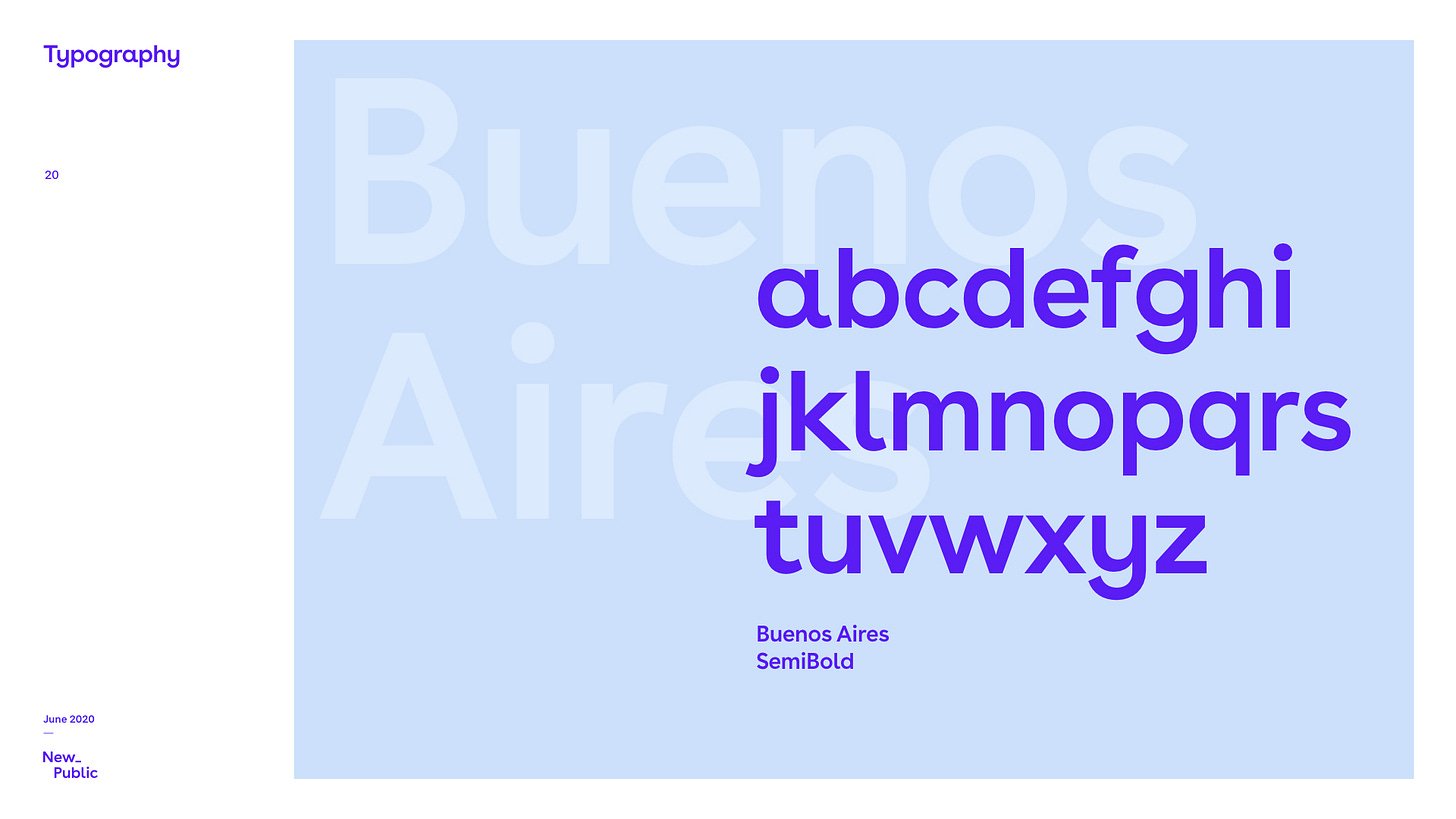
The obvious place to start with most New_ Public visuals is with our brand, created for us by Akufen, a design firm in Montreal. They gave us our visual system, including our colorful, dynamic website. A full brand has all the elements: type, colors, logo, etc., and how they should be used together. In our case, the main typeface is called Buenos Aires, from a Swiss type studio called Luzi Type. “Due to subtle, playful moments, the font looks friendly,” they write. “Whether body text or title, the open forms appear generous.” I agree, especially compared to well-known modernist sans-serifs like Helvetica, another Swiss typeface.
Our logotype is pretty simple, just the phrase “New_ Public”, complete with our infamous, mysterious underscore. I’ve come to like it quite a bit.
We also have plenty of colors to work with. Typically, we’ll stick with this bright palette that matches our organization’s optimism and energy, without being overly flashy or neon.
Here’s an example of how these colors, which appear limiting at first, can be stretched to illustrate a broad range of topics and subjects and make everything feel completely “New_ Public”:
But a new magazine is a special project, and so it makes sense to widen the palette and do things we don’t usually do with the brand identity. Wilfred, the magazine’s editor, said “something a little glitchier, with somewhat sober colors, would be my preference.”
So I began to push in a different direction using Aleo, a slab serif typeface made available by a giant tech company, but for open, free use, which speaks to the nuanced, complicated version of decentralization we’re interested in.
And, to bring out that glitch, that fuzz, I turned to textured brushes that I use often as a cartoonist, from True Grit Texture Supply. Ironically, over the last decade, as artists have moved from paper media to digital, there has been an explosion in digital tools that excel in recreating the fuzzy, imperfect textures and lines of ink on paper. Instead of a clean, perfect edge, I can use brushes to give the lines some tooth and some character. Here’s a close-up:
And here’s what that looks like zoomed out, in the draft of the logo I worked up:
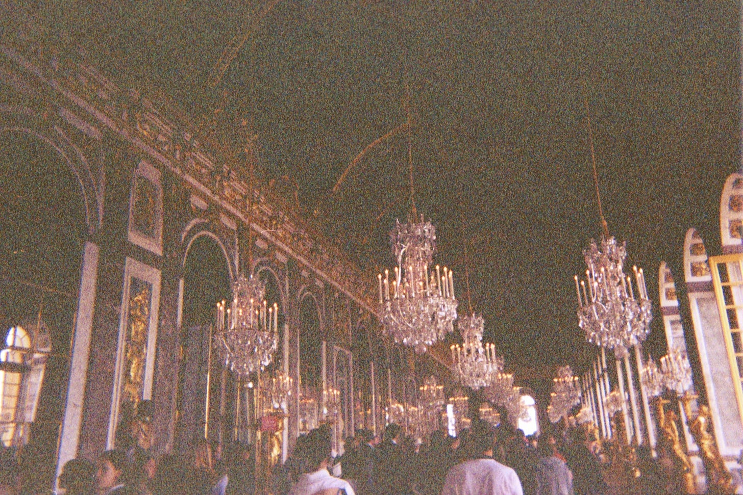
But it’s still missing something. Here’s where photography comes in. Have you ever taken a film photo in a room that’s way too dark, or with the lens cap still on? When I was traveling in 2008, I had my pocket-sized digital camera stolen out of my pocket (go figure), so I resolved to photograph the rest of my trip, a whole month of travel, on two disposable cameras. (Here’s a link for the Gen Z readers who have no idea what I’m talking about.)
Sometimes the photos turned out great, but other times they were a mess, even more so when converted to digital. Think about this process: a plastic shutter opened and exposed a chemical-coated film to light for a short moment; later, a pharmacy employee dunked that film in chemicals, affixing the image permanently and developing it; finally a scanner took a digital photo of the negative and and converted the information into pixels. There are so many steps where that can go wrong, or at least weird. Here’s an example:
Not the most beautiful photo of Versailles you’ve ever seen, right? But I’m actually interested in the stuff at the top, the chemical-to-digital fuzz texture. Here it is, zoomed in and adjusted:
It’s almost pretty, don’t you think? One man’s digital trash becomes a rich texture — just the “something a little glitchier” Wilfred was looking for. It may seem weird to use a texture with greens and yellows on top of blue, but it makes me think of advice I once heard about mixing watercolor pigment: always mix in a color you wouldn’t expect and it’ll make the whole thing a little richer and more interesting. With a little polishing, and quite a few more layers, we get to the final product.
It’s not perfect, but no design can be. At the end of the day, my client was satisfied and we made our deadline. I’d love to hear from you about your happy accidents in the design process. Tell me about your surprising pivots, your unexpected solutions, or your best uses of “digital trash.”
–Josh Kramer
🌐 Online:
Wikipedia at 20: “What’s less obvious is how those shocking events of the early 2000s—including the coverage of 9/11 and Operation Iraqi Freedom, and the media treatment of so-called wikiality—helped make Wikipedia into the so-called last bastion of shared reality that it is today.” (Slate)
Digital conspiracy theories: “Dead-internet theory suggests that the internet has been almost entirely taken over by artificial intelligence.” (The Atlantic)
New social aesthetics: “Chaos edits, by their very nature, can be made up of anything the creator wants... sped-up audio, intentionally shitty image or sound quality enhanced by watermarks or graininess, and disturbing or gross-out humor.” (Vox)
Burning Man, online: “No less than eight virtual worlds were created by Burners under the supervision of the official Burning Man organization, some of them could be accessed via the internet and a browser, some others via VR headsets.” (No Proscenium)
🏙 IRL:
Disinformation astroturfing: “While the BBI campaign sought only to influence Kenyan politics, it’s part of a burgeoning ‘disinformation-for-hire’ industry around the world, in which paid actors, often connected to political figures, are funneled cash to spread propaganda and intimidate opponents on social media.” (Rest of World)
Library e-books: “The high prices of e-book rights could become untenable for libraries in the long run, according to several librarians and advocates I spoke to—libraries, venders, and publishers will probably need to negotiate a new way forward.” (The New Yorker)
Tech and fashion: “The tech industry’s attitude toward clothing illuminates its characteristic attitude toward public space, as well as its hopes to internalize any benefits it creates” (Real Life)
Video game industry: “Game workers are encouraged to think of their jobs as the fulfillment of their childhood fantasies. They get paid to create dream worlds and grant wishes. Isn’t that enough?” (Dissent)
Data centers: “Dozens of cities and counties throughout the United States... are lining up to offer massive tax breaks to big tech companies looking to build data centers, as the demand for cloud-based computing grows to rival the need for other basic commodities.” (Forbes)
Unfinished Business
We hope to see you at Unfinished Live — an immersive festival experience on the future of tech and the possibilities of a decentralized future — on September 23-24, online and at The Shed, Hudson Yards, NYC. This fully-vaccinated event will be two days of panels, “Clubhouse conversations, live podcasts, networking and more.” We hope you’ll join us!
Because we’re a partner in the Unfinished Network, we’re excited to be able to pass on complimentary tickets to the in-person conference at The Shed to subscribers of this newsletter using the promo code NEWPUBLIC100 at this link.
Sign up for Unfinished Live, in person or online, for free. Code: NEWPUBLIC100
Taking the lens cap off,
Josh and Wilfred
Branding by Akufen, illustrations and design by Josh Kramer, promo image courtesy of Unfinished
New_ Public is a partnership between the Center for Media Engagement at the University of Texas, Austin, and the National Conference on Citizenship, and was incubated by New America.


